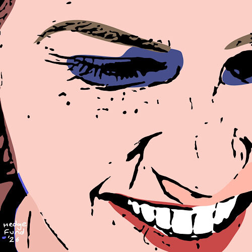
The Bin-Gazer of Babylon: Oboe Ngua and the Global Waste Archive

Some artists search for beauty in sunsets or salvation in the curve of a marble torso. But Oboe Ngua, the world’s only known female bin documentarian, has chosen a different muse: the humble municipal waste receptacle. While others chase light or form, Oboe chases litter. She is on an heroic, and unexpectedly poignant quest—to photograph every bin in the world.

Every. Single. Bin.

Oboe (surname Ngua) began her artistic odyssey sometime in the late 2010s, after what she describes as a “moment of quiet revelation” outside a Little Chef near Loughborough. The sun struck a dented council bin with just the right melancholy—a chiaroscuro of crisp packets and forgotten Monster Munch—and she knew she had found her life’s work. Since then, she has documented over 9,000 bins, across four continents, photographing them with the kind of reverence most reserve for endangered wildlife or church windows.

Her approach is unwavering: one bin, one image, full frontal, unfiltered. No embellishments. Just bin. The results are stark, strangely moving portraits of containers caught somewhere between use and abandonment. Her 2022 show Melancholy Bins of the Danube received critical acclaim, and was promptly banned in Hungary for “aesthetic pessimism.”

Her bins are categorised not only by nation and type—pedal, swing-top, dome-lidded—but also by mood. There are bins of defiance, bins of shame, bins that appear to be whispering something unspeakable into the night. She has spoken, with not a hint of irony, of “the psychological torque of the disused waste bin in Spain.” She refers to landfill sites as “mass graves of late capitalism.” Critics aren’t entirely sure if she’s serious, but she says she is.

Oboe is meticulous. She usually wears gloves. She carries no lighting rig. She once waited four days in a Polish lay-by to snap a recycling bin she had seen on a truck and tracked via Instagram. “It had a story,” she said simply, as if describing a war veteran.

Where most of us see the mundane, Oboe sees monuments to the overlooked. Japanese bins, she tells us, are “modest, a little bashful, with an underlying sense of order.” Italian bins? “Larger than necessary, full of performance, often in relationships with passing pigeons.” English bins? “Perpetually full. Slightly anxious. Trying not to complain.”

To some, her work is a joke stretched to absurdity. But the joke, if there is one and do not forget that she claims there isn’t one, is profound. Duchamp had his urinal. Oboe has the council-issue 240-litre wheelie bin, flanked by crushed Red Bull cans and scented nappy bags. Where Duchamp asked us to rethink sculpture, Oboe asks us to rethink life.

There’s something gently tragic in her quest, too. She knows she’ll never finish. “The world keeps producing rubbish,” she said in a recent panel discussion, “and so I’ll just keep documenting.” When pressed about the futility of the task, she mis-quoted Beckett: “Ever tried harder. Ever failed deeper. No matter. Photograph another bin.”

And so she does. With scissors for tape, a camera for brush, and the courage to look deep into humanity’s polyethylene soul, Oboe gives us a world we’d rather not see—but can’t stop looking at.

Goalie Goes Up: The Art of Leaping Toward the Impossible

Somewhere between the sacred geometry of Kazimir Malevich and the muddy poetry of Sunday league football lies the artist known only as Goalie Goes Up—a name that evokes panic in both the penalty box and the gallery, with its reckless pursuit of glory. This is not merely an alias, but a manifesto. A gesture. An abstraction in motion.

To encounter Goalie Goes Up’s work is to be suspended in a moment of potential energy—“like a goalkeeper,” as one critic has noted, “leaving the safety of the line to chase a corner he will never reach.”* England fans know this sensation well: a bold dash, a nation breathless, and then the crushing inevitability of failure. A loop repeated every four years since 1966, with the unyielding optimism of Lear’s fool: “Thou shouldst not have been old till thou hadst been wise.”

The work itself? Think digital paint not flung but placed, rather like limbs in a last-minute set piece. Shapes avoid collision. Lines buckle. Every canvas is a pitch, every mark a movement, yet not necessarily a goal. There’s a tension between aggression and grace, between the measured formation and the wild lunge. You do not look at a Goalie Goes Up work so much as hear it—boots scraping, lungs bursting, the sound of eighty thousand hopes deflating all at once. It’s as if Caravaggio had spent a rainy childhood watching Tranmere Rovers.

Yet, beneath this appearance of chaos lies thought—philosophy, even. In the artist’s rare interviews (delivered in cryptic riddles on annotated team sheets), she suggests that her abstractions are gestures of belief in the face of impossible odds. “I leap,” she once wrote on the back of a canvas, “not to catch the ball, but to remain human.”

This is art not for the trophy case, but for the long journey home. As Voltaire put it, “One must imagine Sisyphus happy”—or perhaps, one must imagine Sisyphus leaving safety behind and jumping for a late equaliser in extra time.

The cultural critics, understandably confused, have compared Goalie Goes Up to everyone from Cy Twombly to David Seaman. But such comparisons miss the point. This is not an artist who plays with stylistic coherence. Each piece is a stoppage-time decision. A scramble. A tangle of limbs and lines in search of transcendence. Some fail utterly. Some hit the post. But occasionally, gloriously, the art connects—cleanly, sweetly—with a viewer, and the crowd roars.

England’s record in World Cups (one win, eternal heartbreak) finds strange resonance in this practice. The bold lunge of Goalie Goes Up is a national allegory: hopeful, doomed, noble in its futility. It is Beckham’s red card, Southgate’s missed penalty, Pickford’s fingertips. It is art that remembers every near miss and celebrates them as if they were victories.

What a play Shakespeare would have written, had he focused his skills on football. We can only guess what he would have said, but we know that he knew a thing or two about tragic ambition. Maybe he would have described this art with words he gave to Henry V: “Once more unto the breach, dear friends, once more.” The goalie goes up—not because he should, but because he must.

And in that absurd, beautiful leap, leaving his own goal asunder, art lives.

*Kingsley Break, Art Listner, July 2024

Silhouette portraiture: the Regency’s equivalent of Instagram filters, only more dignified and less prone to bad lighting.

Enter Jane Bastion, alias the “Queen of the Silhouette,” who has taken it upon herself to resurrect what she charmingly calls the “shade picture.” It’s a glorious throwback to an age when you didn’t look snarky on your phone—you just looked… a colour—on pale paper.

Back in the late 18th century, having your silhouette done was all the rage. Jane Austen? Almost certainly snagged one. Darcy and Elizabeth Bennet? Portrayed in profile, naturally, before eloping. Bastion, however, prefers to distance herself from mere gimmicks. She insists on the term “shade picture.” In her words, “You think silhouette portraiture is incredibly easy? Then why aren’t you a world‑famous silhouettist, whose work hangs alongside collectors like Davide Plankton and Quentina Wrigly?”

To most of us, trim a profile from black card and stick it to white, voila. But Bastion begs to differ. She argues there’s an art to capturing the perfect Regency visage: the aristocratic tip of the nose, the curl of a chignon, the covert smirk suggesting one might moonlight as a clandestine duellist.

Bastion’s practice is part revival, part satire. She taps into the nostalgia for genteel intimacy—miniature likenesses traded among lovers—but also pokes fun at the solemnity of fine art. Her “shade pictures” look at once quaint and subversive. They’re Regency theatre in silhouette form: proper on the surface, risqué in spirit.

This playful revival is timely. In an era of glossy selfies, filters, and desperate attention-seeking, Bastion’s work reminds us that anonymity can be stylish. A carefully clipped profile invites imagination: who is the subject? What secrets do they harbour in their pointed jawline? You see nothing—and yet, everything.

Her commissions come with a lighthearted warning: “Attempt at period coiffure optional; emotional restraint mandatory.” Patrons are invited to strike a pose, turn left, and hold still—then surrender to Bastion’s scissors and discerning eye. What emerges is a delicate conversation between light and dark, presence and absence.

In short, Bastion is doing for silhouette what DJs did for vinyl: reviving an analogue aesthetic with ironic wit and discerning taste. Her work reminds us that sometimes less is more—especially when less is cut from black card by a master.

If Jane Bastion is indeed the Queen of the Silhouette, it’s because she reigns over an art that nearly vanished, infusing it with wit, charm and unexpected elegance. So next time you find yourself craving a break from the filtered façade of the digital age, consider sitting for a shade picture. You’ll leave looking dignified, mysterious—and just the right amount of Regency.

Interview with Spen Leopard, collage artist

Spen Leopard took some time out from collaging the walls of the Queen of Bordeaux’s London residence to speak to us about their career and hopes for the future.

Interviewer (I): Spen, thanks for joining us. To start, tell us a bit about your background.

Spen Leopard (SL): Hello. I grew up in a lighthouse on Scotland’s coast—just me and my parents, who both kept the light burning. That isolation shaped my inner world; for company, I had the crashing waves and my own imagination .

I: That sounds magical. When did you first experiment with collage?

SL: As a child, I’d collect scraps from my parents’ newspaper and old magazines. By my teens I was layering images—boats, birds, torn maps. That formal collage practice didn’t arrive until later, but the habit of curating fragments began in the lighthouse .

I: What themes run through your work?

SL: Central themes are isolation, belonging, and place. Many pieces juxtapose storm-battered nature with human artifacts—ruined piers, handwritten letters, vintage adverts. There’s a tension of fragility and endurance that echoes the lighthouse environment.

I: Walk us through your creative process.

SL: When working non-digitally, I start by gathering ephemera—old postcards, ticket stubs, botanical drawings, bits of text, old menus. Then I lay them onto board, playing with composition until it feels balanced. I glue, layer, and sometimes stitch elements. The result is a textured narrative; each piece reveals stories in the cracks and overlaps.

I: Do you work to a plan or let intuition guide you?

SL: A bit of both. I often begin with a rough idea—a coastal walk or lighthouse motif. But once I’m in the flow—cutting, layering—intuition takes over. It’s like letting the pieces find their own dialogue.

I: How has your upbringing informed your aesthetic?

SL: Living remotely taught me to find value in overlooked details—drip-worn wood on a jetty, a drift seed washed ashore. That attention to detail informs both my material sourcing and my imagery. I want to capture the beauty in the broken and the forgotten.

I: Where do you exhibit your work?

SL: Most recently I had a solo show in Ephesus featuring a nine-piece series called “Beacon Echoes”—all collage-layers of light, rust, shoreline texts. Pimlico Wilde picked up several works and are representing me as well . I’m hoping to exhibit across the UK and beyond in the coming year.

I: What’s next for you?

SL: I’m planning a collaborative series with a poet—combining collage with fragments of marine-inspired verse. I’ll also be sourcing materials from lighthouses across Scotland and Northern England. It’s a way to share both visual and poetic memory.

I: What do you hope viewers take away from your collages?

SL: That art can be woven from small scraps—fragments of time and memory. That there’s poetry in ordinary things if we listen. And that isolation, when deeply attended to, can generate connection.

I: Beautiful. Thanks, Spen, and we look forward to seeing your new work.

SL: Thank you—it’s a pleasure to share a glimpse of my world.

Interview with perambulator Chester Hubble

An interview with Chester Hubble, instigator of the “Heavy‑Metal, pan‑city, blindfolded perambulations” form of fine art. ****DO NOT IMITATE CHESTER****

Interviewer (I): Chester, thanks for speaking with us. Your current project—walking blindfolded across cities while listening to heavy‑metal podcasts—sounds intense. What draws you to this?

Chester Hubble (CH): Hi, it’s good to be here. I’m fascinated by tension: the clash between freedom and control, the vulnerability of being unsighted in urban environments, and the adrenaline rush of danger—like crossing busy roads blindfolded . The heavy‑metal soundtrack amplifies the emotional rollercoaster.

I: You record the things you “walk into” during these perambulations. Could you explain that process?

CH: At the end of each day I transcribe everything I’ve accidentally walked into—poles, bins, people, dogs, telephone boxes, etc—onto canvas. If I’m injured—say, knocked over by a super‑car on Park Lane, which has happened eleven times—I restart that day’s walk after recovery, so I capture a full consistent record.

I: Wow—knocked over eleven times on one street? How do you manage that risk?

CH: It’s part of my fine art practice. Risk is integral. I used to do free-running, but it needed that extra addition of blindfoldedness. I ensure I can recover and record. If I’m hospitalised, that day’s walk is nullified and retried once I heal.

I: You’re taking these walks across London. What’s your diary like during the project?

CH: Not just London, any city that catches my fancy. Each morning I wake with a strong urge to “feel the city.” I then walk—usually blindfolded—for hours, guided by instinct, heavy‑metal energy, and urban sounds. My diary is sporadic—sometimes a philosophical note before departure, sometimes a simple list after.

I: Are your installations solely the canvases with transcriptions, or does the walk itself function as a performance?

CH: It’s both. The live, unsighted walk through city traffic is the performance. The canvas becomes its physical residue—objectifying all the collisions and near‑misses into something to study and experience vicariously.

I: You mentioned walking on stilts in Camden while blindfolded. What kinds of rituals or props do you use during your walks?

CH: One idea is blindfolded stilts, halfway between absurdity and spectacle. I even hired someone to shout “HE’S NOT MAD, HE’S MAKING ART” at people who get too close.

I: That’s theatrical! What happens if someone intervenes while you’re blind?

CH: Interventions become part of the performance. Someone tries to help, I record that too. The city reacts to my vulnerability—it’s all material.

I: What does your next walk look like?

CH: Tomorrow I’ll be in Southend on Sea. Still blindfolded, maybe on stilts. I’m testing my limits, and the local drivers’ tolerance, again.

I: Finally, what do you hope people take away from your project?

CH: To feel the tension of trust—trusting yourself, the city, and the random. And to see art in hazard: the danger we walk through daily, often unthinking.

I: Thank you, Chester. Best of luck on your next escapade.

CH: Thanks.

Interview with Hackson Jollock: Lines, Fury, and the Endless Loop of #64

Hackson Jollock is one of Britain’s most ferociously original visual artists—if not always the most serene. His canvases are an explosion of line and motion, electric with frustration, precision, and improvisation. His latest work, titled simply #64, is a tangle of looping, frenetic lines in indigo, copper, and blood red. It’s been hailed as both a “nervous system laid bare” and “a topographical map of thought.” But one thing is certain: whatever you do, don’t mention Jackson Pollock around him.

Interviewer: Hackson, thank you for joining us. Let’s begin with the elephant in the room—your name and the inevitable comparison to a certain American painter.

Hackson Jollock:

Look, I didn’t choose to be born with a name that sounds like a pun. That’s my parents’ fault, not mine. But I’ll say it once and for all: I am not mimicking Jackson Pollock. I do not drip. I slash. I etch. I rage. Pollock was obsessed with surrendering to the unconscious. I’m busy interrogating it. If you want to talk about influence, let’s talk about Kandinsky, Cy Twombly, or the London Tube map. But enough about Pollock. Let him rest.

Interviewer: Understood. Let’s talk about your latest piece, #64. It’s a field of restless lines—some looping, some slicing—and signed in bright red in the corner. What’s going on here?

Jollock:

It’s a language, or the breakdown of one. I think of my work as a kind of graphic stammer. Every line is a stutter, a contradiction, a backtrack. #64 is part of an ongoing series exploring failure—failure of communication, failure of memory, failure of form. I wanted to see what happens when you just keep drawing until the meaning collapses.

Interviewer: There’s an almost musical quality to the piece, like jazz improvisation. Is that deliberate?

Jollock:

Absolutely. I sometimes listen to free jazz when I work. Ornette Coleman, Sun Ra, early Soft Machine. I’m not painting to the music—I’m painting inside it. The lines are phrasing. They’re riffs. Sometimes I leave spaces like rests in a measure. #64 is noisy, but there’s rhythm in the chaos. That’s where the tension lives.

Interviewer: You’ve said before that you don’t “plan” your works. But surely a piece like this has structure?

Jollock:

There’s structure in the aftermath. When I begin, I don’t have an image in mind—I have energy. Anger, mostly with this one. I start with a single color and move as fast as I can. Then another color. Then another. I don’t stand back until it’s nearly over. Only then do I see the shape of what I’ve made. It’s like fighting your way through fog and realizing you’ve built a cathedral out of your footsteps.

Interviewer: Many of your paintings feature the number titles—#37, #48, and now #64. Is that a rejection of narrative?

Jollock:

Yes. And no. The numbers are part of the narrative. They’re coordinates in my brain’s geography. I don’t want to tell you what to see. I want you to look and feel. If I called it “Tension Between Lovers in a Mid-Sized Town”, you’d bring your own tired baggage. #64 could be anything. It could be you.

Interviewer: Do you ever think your work is hard for people to access?

Jollock:

Good. I don’t want to be accessible. I want to be intrusive. Art should interrupt your day, not decorate your flat. If someone looks at #64 and feels overwhelmed, irritated, confused—that’s a success. That means I’ve reached them before they’ve reached for an explanation.

Interviewer: Finally, what’s next for Hackson Jollock?

Jollock:

I’m building a machine that draws without stopping. A mechanical extension of my process. It will never sleep. It might draw forever, or it might jam up in five minutes and implode. I think that’s perfect.

#64 is currently on view at the Pimlico Wilde Gallery, London. Viewers are encouraged to bring their own interpretations.

Interview with Ptolemy Bognor-Regis: Chasing the Ultimate Painting

In the shadow of great fortune and brighter genius, Ptolemy Bognor-Regis has emerged as one of the most talked-about figures in contemporary abstract art. The son of a shipping magnate turned media tycoon, Regis might have been content with a life of patronage or leisure—but instead, he’s hurled himself into the center of artistic inquiry with a singular ambition: to create the last painting. The final word. The full stop of the visual age. We sat down with him to discuss his mission, his methods, and the piece he calls “A Bank Robbery in the Environs of Machynlleth.”

Interviewer: Ptolemy, first of all, thank you for making time for this interview. Your latest work is causing a stir—critics have called you “the Rothko of Wales” and it “an act of chromatic violence.” What do you see when you look at A Bank Robbery in the Environs of Machynlleth?

Ptolemy Bognor-Regis:

Thank you. What I see is the inside of a scream—a narrative collapsed into geometry. It’s not a painting of a bank robbery, obviously. It’s a record of the tension before and after such an event. The colour fields are characters. The orange is the alarm. The purple, a kind of communal numbness. The black shapes? They’re decisions, heavy with consequence.

Interviewer: There’s a boldness to your use of negative space. In this piece, the forms press against each other but never quite resolve. Is that intentional?

Regis:

Absolutely. Resolution is the enemy of truth. I’m not here to make peace on canvas—I’m here to expose the war beneath it. The non-resolution is the story. Harmony would be a betrayal of what I’m trying to capture.

Interviewer: You’ve described your artistic goal as “striving after the ultimate painting, after which nothing more can be said.” That’s a monumental ambition. Where does that come from?

Regis:

It comes from impatience, honestly. Impatience with repetition, with the saturation of half-statements in art. I grew up surrounded by enormous wealth, which gave me access—but also a kind of nausea. When everything is possible, meaning becomes slippery. I paint to locate meaning again. To pin it down once and for all, and then be done with it. After the final painting, there should be silence. A holy hush.

Interviewer: That sounds spiritual.

Regis:

It is. But not religious. I think of painting like monastic labor. Endless refinement, shaving away noise, until you hit the essential chord. One brushstroke away from revelation, always.

Interviewer: You’ve said you don’t use assistants, despite having the resources. Why?

Regis:

Because the images record my hesitation, doubt, and triumph. No assistant can fake that. I don’t want a painting that looks clean—I want one that’s wounded. That’s something you have to do yourself. Otherwise it’s merely decoration.

Interviewer: There’s a lot of speculation about your process. Some say you work in total darkness and then assess the result later. Is that true?

Regis (laughs):

Yes. And no. I do draw blind sometimes, but not always in darkness. It’s about trust—trust in the materials, trust in the moment. It’s like holding your breath underwater and waiting for the exact second the body tells you: Now. Draw that.

Interviewer: Looking ahead, do you believe the “final painting” is near?

Regis:

Some days I think I’ve already made it and just haven’t realized. Other days, I think I’m still a thousand lifetimes away. But I’ll keep trying. That’s all I can do.

Interviewer: What’s next for you?

Regis:

Silence. Reading. And perhaps that mythical final work.

A Bank Robbery in the Environs of Machynlleth is currently on view at Pimlico Wilde, London.

Film Review – Velocity of Fragility

Directed by: “The People’s Cinema Machine”

Runtime: 98 minutes (including credits)

Language: Mandarin, with occasional German shouting

Budget: ¥11,000

There are films that wear their influences on their sleeve. Then there are films like Velocity of Fragility, which steals the entire sleeve, stitches it to a knock-off leather jacket, and insists—somewhat poetically—that it invented sleeves in the first place.

Purportedly made by a loose filmmaking collective from Guizhou province calling themselves The People’s Cinema Machine, this low-budget Chinese tribute/rip-off/interpretation of Sylvain Jasper-Fuchs’s Fragile Velocity is a work of astonishing nerve, complete incoherence, and unexpected sincerity.

The Plot, such as it is

The protagonist, known only as “Man” (played with affecting disinterest by former karaoke technician Gao Feng), wakes up in a forest made of curtains. There is a photo of a horse nailed to his bedroom door. His mission—though we are never told why it is his mission—is to deliver an encrypted USB drive to someone known only as “The Neigh.”

Along the way, he fights off helmeted monks, questions a tree about the nature of betrayal, and engages in a gunfight choreographed like Romeo and Juliet- the ballet. The narrative folds in on itself like badly steamed dumplings. Characters vanish mid-sentence. A love interest appears in the second act only to transform into- but I can say no more without ruining the film for you.

Familiar… Too Familiar

Let’s be clear: this is Fragile Velocity filtered through a dusty projector, with half the subtitles missing and the other half clearly translated via three layers of AI. But there’s a charm in the script. The long tracking shots are present, though here achieved by putting the cinematographer on a push scooter. The voiceover murmurs philosophical nothings (“The hoof remembers what the heart forgets”) and there’s an extended slow-motion scene of a man being slapped by a pigeon.

All the classic Arthouse-Action ingredients are here: whispered soliloquies, rain that falls only in one corner of the frame, and violence, so much violence. Yet it’s somehow even more opaque than the original, mostly due to budget constraints and a deliberate refusal to explain anything.

Highlights

The soundtrack: A haunting blend of pan flute and dial-up modem noises.

The villain: A ventriloquist dummy with LED eyes named “Velocity.”

Low Points

Much of the dialogue is inaudible, save for the occasional shout of “Sorry, I didn’t mean to shoot you!”—an apparent cue to deploy the film’s one working special effect. Fight scenes are mostly people falling over in rice fields.

Final Verdict

An absurd, earnest knock-off made with ambition, smoke, and borrowed trench coats. Often incomprehensible, frequently derivative, and yet… oddly touching.

Power at the Periphery: Turbulence at Pimlico Wilde?

In the well-lit corridors of Pimlico Wilde — that sharp dealer-gallery that has been taking over the world – something quietly baroque has been unfolding. Known for its precision curation and its increasingly opaque roster of conceptual heavyweights, the gallery now finds itself in the midst of an internal realignment. Not quite a mutiny, not quite a renaissance.

Founded centuries ago, some say by William the Conqueror, and led recently by Adrian ffeatherstone and Tabitha Vell, Pimlico Wilde quickly carved out a name as the destination for collectors seeking art that didn’t behave. It cultivated a deliberate difficulty — conceptualism without compromise, painting that refused to flatter, sculpture that seemed morally uncertain. Its recent embrace of the Invisibilism movement (art that often isn’t perceptible at all) only amplified this identity. It was the thinking person’s edgy gallery, or perhaps the edgy person’s thinking gallery.

But over the past year, those close to the gallery have noticed a tonal shift. “It’s become strangely… chaotic,” murmured one curator, preferring to remain anonymous.

At the centre of the current tremour is the subtle ascendancy of Renata Blume, the gallery’s deputy director and former head of conceptual strategy. Once known primarily for her footnotes — literally, she contributed erudite footnotes to several artists’ statements — Blume has been increasingly visible. She is said to have masterminded the recent show by the anonymous artist known only as V, the Invisibilist whose Untitled (Tension at 2:13pm) sold for £180,000 despite being a vitrine containing nothing but curated unease.

Sources describe a growing “intellectual faction” around Blume, favouring works that don’t need to be seen, owned, or in some cases, even made. This has clashed — diplomatically but unmistakably — with the more object-based philosophy of James Dower-Hythe, Pimlico Wilde’s quietly pragmatic director of sales, known for pushing discreetly exquisite, materially lush pieces to collectors with sharp suits and dull eyes.

There was, according to one staffer, “a moment at Windermere Art Festival where James tried to physically gesture toward an invisibilist sculpture, and Renata told him, quite calmly, that his gesture was itself problematic. That, it seems, was the beginning of the rift.

Further internal tension surfaced with the now-cancelled retrospective of Fabrizio Munt, a 1990s video provocateur whose recent works — which include a 45-minute loop of him naming extinct Amazonian moths while dressed as a Lufthansa pilot — were deemed “insufficiently deconstructed” by Blume’s camp. Dower-Hythe, who had secured a major collector’s backing, was reportedly “deeply displeased” and briefly walked out of a planning dinner at Rochelle Canteen. (He returned after pudding.)

Meanwhile, the duo, ffeatherstone and Vell, have taken noticeably different tacks. ffeatherstone has all but vanished into “strategic development,” while Vell — still piercingly elegant in her black Comme des Garçons and veiled sighs — has been seen attending shows in total silence, flanked by a young assistant who carries no device, only a hardback notebook.

The future of Pimlico Wilde is, appropriately, a matter of interpretation. There are whispers of a split. Or a pivot. Or a new space — a non-space, even — rumoured to open “somewhere unrevealed” to house the gallery’s more metaphysical offerings. There are even murmurs of a “non-exhibition programme” designed to resist “the tyranny of viewing altogether.”

Still, none of this has dampened the gallery’s appeal. If anything, it has enhanced it. As one seasoned collector put it at a recent dinner (held in a dining room lined with mirrored absence):

“It used to be about what they showed. Now it’s about what they withhold. That’s the new luxury.”

In other words, the power struggles at Pimlico Wilde may not be a problem at all — they may be the gallery’s most compelling work yet.

The Most Expensive Conceptual Artworks Ever Sold

By Lydia Voss-Hammond

Conceptual art has always asked big questions: What is art? Who decides? Can you invoice someone for an idea? As it turns out, yes — and often for millions.

Below are the most outrageously expensive conceptual artworks ever sold, proof that in today’s art market, a compelling concept can be worth more than gold.

1. Untitled (The Artist Is Not Present) — £6.3 million

Artist: Lucca Vonn

Sold: 2023, Basel

Lucca Vonn’s minimalist masterstroke involved renting an empty gallery space, placing a single folding chair in the middle, and… not showing up. For three months. The gallery posted daily updates confirming the artist’s continued absence.

The buyer received:

• A legal certificate of absence

• A guestbook signed by confused viewers

• The folding chair (optional, extra £20,000 for insurance)

Collectors called it “a haunting exploration of ego and expectation.” Critics called it “an invoice with lighting.” The market called it: SOLD.

2. NFTitled #1 (Now Fungible Tomorrow)

Artist: Gl!tch.eth

Sold: 2021

An NFT that was self-aware enough to predict its own irrelevance. This looping 12-second video featured a slowly pixelating Ethereum logo, overlaid with the text:

“This will be worthless by the time you brag about buying it.”

Despite its cynicism — or perhaps because of it — it sparked a bidding war among crypto collectors. Its value later crashed to 40p and then mysteriously rebounded to £47 million after Gl!tch.eth tweeted: “I’m deleting my wallet.”

Still considered the only NFT to successfully roast its own buyer.

3. Untitled (You Thought It Was Included) — £4.9 million

Artist: Delia Flux

Sold: 2020

This piece made headlines when a collector paid nearly £5 million for what they believed was a monumental glass sculpture — only to discover the sculpture was not included in the sale. What was included? A printed receipt stating:

“Ownership is the illusion. Thank you for participating.”

Flux later clarified in an artist’s note: “The sculpture exists emotionally, not legally.” The collector reportedly wept for 40 minutes, then put on a brave face, called it “the most powerful thing I’ve ever bought,” and tried to sell it immediately on the secondary market.

4. Silence, Auctioneer — £4.3 million

Artist: Milton Perchton

Sold: 2024

The concept: a work sold during a real auction, in total silence. No bidding, no names, no numbers — just a quiet nod from a buyer and a muted tap from a gavel made of felt. The piece was described as “a rebellion against spectacle” and “a slow clap in art form.”

Nothing physical changed hands. The buyer received a notarized video of the silent auction and a small wooden block labeled “Proof of Presence.”

Rumor has it another bidder tried to “out-silence” the buyer with a stronger nod but was disqualified for blinking.

5. Enormous Pile of Money #6

Artist: Hedge Fund

Sold: 2025, Pimlico Wilde

We couldn’t leave this one out. The artist Hedge Fund — conceptual art’s shadowy high priest of profit — sold a digital, data-driven rendering of a pile of money that inflates and deflates in real time with global markets. Collectors own fractional shares; the pile grows if capitalism thrives, shrinks if it falters.

Described by one critic as “Warhol with a calculator,” and by a hedge fund manager as “relatable.”

Included in the purchase:

• A VR headset

• A market-linked music score for the harpsichord.

• And the distinct feeling you’ve been both mocked and immortalized

Honourable Mention: Empty Frame With Price Tag Still Attached — £1.2 million

Artist: Unknown

Sold: Also unknown

Was it a prank? A mistake? A masterwork of minimalist irony? We may never know. But someone bought it — and the market applauded.

Conclusion

Conceptual art isn’t about what you see — it’s about what you paid to believe you saw. And if that belief costs millions, well, that’s just part of the concept.