London Café by Pho To

Newly available.

In this photograph, Pho captures the tension between interior intimacy and the relentless flow of the city beyond the glass. The café, with its muted palette of blonde wood and softened shadows, becomes an anonymous stage upon which figures sit in partial silhouette. Suggesting both companionship and isolation, their presence is blurred just enough to deny individuality and instead evoke archetypes of urban transience. Against this tableau, the woman in the foreground,poised, momentarily caught mid-turn,anchors the composition with a cinematic sense of inevitability, as though she is both participant and observer in a fleeting narrative.

What elevates the image is its dialogue with time: the distortion of the lens bends reality, compressing the hurried geometry of street life into an almost painterly swirl. The exterior bleeds into the interior, the outside world pressing in through windows that no longer serve as mere barriers but as thresholds between states of being. The private and the public collapse into one another in what is not a simple café scene, but rather a meditation on the porousness of modern existence, where every reflective surface reminds us that we are always both watching and being watched.

On Flatness and the New Aristocracy

by Helmut de Rococo

(Originally published in the pdf-only catalogue for Ptolemy Bognor-Regis III: Works from the Blur Period, Pimlico Wilde West, 2025)

“When the canvas no longer holds paint but protocol, the brush becomes a cursor,and the artist a landlord of pixels.”

, Elana Kvant, “Surface Tensions: Digital Nobility and the Aesthetic of Owning,” 2019

It is no longer meaningful,perhaps no longer even possible,to speak of painting in its historical sense. Surface, once the locus of tension between intention and accident, pigment and gesture, now lies flat and backlit. This flatness, long prophesied by Greenberg, no longer signals aesthetic purity. In the hands of a new breed of aristocratic image-makers, it marks dominion.

No artist exemplifies this better than Ptolemy Bognor-Regis III.

To understand Bognor-Regis III’s practice, one must almost discard the vocabulary of composition and colour theory and instead take up the lexicon of fealty, estate, and simulation. For what we encounter in his work is not painting in any conventional sense, but rather a highly stylised expression of what I have elsewhere termed digital feudalism,a new socio-aesthetic order in which image production mimics the hierarchies of dynastic wealth, platform control, and data possession.

The Aesthetic of Inherited Authority

Bognor-Regis III does not seek the viewer’s comprehension; he assumes it as a birthright, only to withhold it. His works,aggressively flat, sometimes violently empty,offer neither perspective nor entry. Instead, they announce their presence like heraldic banners in a castle courtyard. One does not read or interpret them; one beholds them, as one might behold the seal of a duchy one cannot enter.

This is no accident. The artist, descended from Ptolemy Bognor-Regis II, a man whose influence spans football, philanthropy, and forthcoming yacht-based reality television, operates within what we might call the Aesthetic Sovereignty of Legacy. His gap-year abstractions, allegedly inspired by Colombian road signage, are not so much about travel or encounter as they are about the performance of cultural inheritance,flattened, dislocated, and repackaged as NFT-friendly mystique.

Surface as Domain

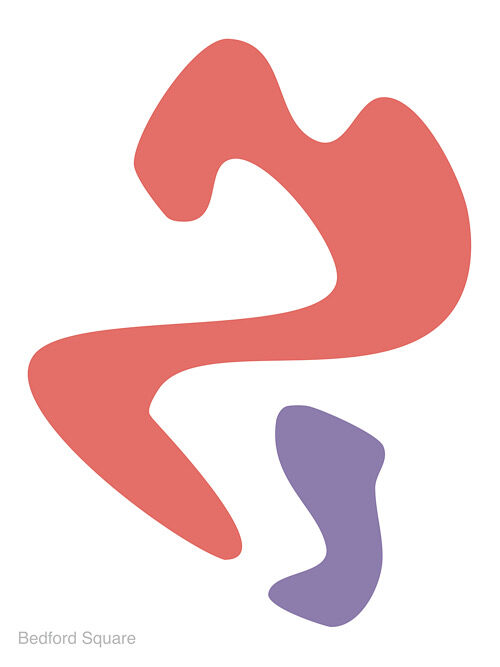
Consider his series “Signs Before Breakfast.” At first glance, they appear to be abstract compositions of digital brushwork,semiotic storms rendered in retinal-dulling palettes. But a closer (or rather, more cynical) inspection reveals something more architectural: the paintings are meticulously gridded, rigid in aspect ratio, and carefully optimised for screen, print, and projection. These are not expressions; they are zoning maps,flat territories over which the artist asserts symbolic control.

Just as feudal lords claimed fiefdoms with banners and crests, so Bognor-Regis III lays claim to cultural real estate through aesthetic domain-staking. In doing so, he joins a new class of what I term Creative Lords,those who do not directly generate content for publics, but rather lease their presence through limited-access viewings, QR-gated editions, and catalogue essays published exclusively in proprietary file formats.

The Myth of Depth, The Theatre of Flatness

Art history has always flirted with flatness, but never has it embraced it so fetishistically. In the 20th century, flatness was political: a renunciation of illusionism, a strike against the bourgeois cult of verisimilitude. In the 21st century, under the reign of the New Aristocracy, flatness is no longer revolutionary,it is performative silence, an aspirational opacity.

This is where Bognor-Regis III excels: in crafting surfaces so flattened in depth that they transcend it. His refusal to offer interpretation is not coyness; it is class performance. The artist’s statement,“My work is so deep and meaningful that it can only be expressed in abstract paintings”,isn’t naïve; it is a heraldic riddle, a dare issued from the castle’s turret.

Conclusion: From Patronage to Platform

We must be clear-eyed: Ptolemy Bognor-Regis III does not paint, rather he manages aesthetic capital. His works function not as objects of aesthetic contemplation, but as tokens of presence in a closed system of symbolic exchange. They are no more paintings than a blockchain ledger is a poem.

In this sense, he is not a charlatan but a mirror. His oeuvre reflects the rise of a new aesthetic aristocracy,one that inherits bandwidth, leases meaning, and builds castles made of code.

If painting once aimed to democratise vision, the work of Bognor-Regis III reasserts the primacy of possession over perception. And perhaps that is his most radical gesture.

Helmut de Rococo is an independent theorist of surface ideologies, aristocratic visualities, and hyper-mediated art practices. He divides his time between Vienna, Bogotá, and a small server farm outside Dubrovnik.

New work: Bedford Square by My Friend Leslie

My Friend Leslie’s latest work, Bedford Square operates in that fertile interstice between biomorphism and linguistic deferral, where form insists but never coheres, where signification hovers like a mirage. Two figures,one a sprawling vermilion, the other a more compact lavender,occupy the white ground with an ambivalence that resists both compositional resolution and narrative absorption. What emerges is not an image in the conventional sense, but an ontological problem staged through colour and contour.

The larger red form, with its oscillations between curve and jut, suggests the bodily without ever descending into figuration. It recalls the residual anthropomorphism of Arp’s early reliefs, yet the crisp flatness of its surface pushes it toward the digital, toward a vectorized aesthetic that displaces tactility with pure sign. In contrast, the lavender fragment reads as a supplement or trace, invoking Derrida’s notion of the parergon,that which both belongs to and exceeds the frame, marking the instability of inside and outside, figure and ground.

The faint inscription “Bedford Square” in the corner functions less as a title than as an epistemic intrusion. Here, language sutures itself to abstraction, demanding that we think the work as situated,within geography, within history,while simultaneously refusing to clarify its relation. Is the image a map? A psychogeographic dérive? Or is the textual residue merely a destabilizing gesture, reminding us that no abstraction is ever pure, that every form is haunted by context?

My Friend Leslie’s abstraction, then, is not an escape from the world but a reconfiguration of it,an abstraction that acknowledges its own impurity, its semiotic leakage. It is tempting to read the crimson figure as presence and the lavender as absence, but such binaries collapse in the act of viewing. What persists is tension: between assertion and withdrawal, legibility and opacity, surface and depth.

In the end, My Friend Leslie situates themselves in dialogue not only with the formal histories of modernism (Matisse, Kelly, Arp) but also with the post-structural suspicion of closure. The work is less an image to be looked at than a proposition to be inhabited,a reminder that abstraction’s vitality lies not in what it depicts, but in how it perpetually defers depiction.

Compton – An Exhibition Wall Panel Piece

Compton, Room 2: Landscapes of Disquiet, 2025

UV-cured ink on cotton canvas, 64 x 64

In Room 2: Landscapes of Disquiet, conceptual artist Compton returns to text and reframes the traditional exhibition wall panel as a complete, self-contained artwork. By appropriating and recontextualizing curatorial text originally written for another artist’s show, Compton challenges the conventions of authorship, interpretation, and institutional authority.

The piece reads as an eloquent meditation on landscape and emotion,but in Compton’s hands, it becomes something more: a landscape made of language. The viewer is invited not to imagine the works described, but to consider the descriptive act itself as a performance of meaning-making.

With his signature clarity and subversion, Compton transforms informational text into a poetic object. Clean typography, deliberate spacing, and the cool neutrality of the format only deepen the conceptual tension: what happens when the framing becomes the framed?

Part critique, part homage, and wholly original, Room 2: Landscapes of Disquiet exemplifies Compton’s sharp wit and intellectual rigour. It is a standout piece in his ongoing investigation into the structures that shape our encounters with art.

Price on Request

Sandy Warre-Hole – But Was This the End?, 2025

Digital illustration on archival print

But Was This the End? is a question, an echo, a final frame with no clear origin. In this hauntingly sleek work, Sandy Warre-Hole once again straddles the blurred boundary between narrative and void, assembling a digital portrait that feels more like a film still pulled from a non-existent noir, one where the femme fatale is also the protagonist, the author, and the product.

Rendered in their now-iconic style of flattened colour planes and unapologetically artificial features, Warre-Hole delivers a stark, frontal image of a woman with peroxide-blonde hair, oversized black sunglasses, and crimson lips – the triumvirate of glamour, opacity, and danger. She is instantly iconic and yet somehow anonymous, her identity concealed both literally and metaphorically. This is not a likeness, but a symbol. She could be anyone. She could be everyone.

And then, in the lower left corner, that enigmatic phrase: But was this the end? Typeset in a box that recalls comic book captions or the credits of a telenovela, it injects a cinematic temporality into an otherwise static image. The text implies narrative while simultaneously denying it, a trick Warre-Hole executes with surgical precision. Is this an ending, or merely a beat before the next performance begins?

Visually, the image owes a debt to Pop’s legacy , Warhol, of course, looms large , but Warre-Hole diverges from mere replication by incorporating the affectless sheen of post-social-media visual culture. This is not celebrity idolisation; it is brand embodiment. The woman here is less a person than a constructed shell: sunglasses like screens, lips like emojis, hair like a marketing choice.

Yet, far from being cynical, But Was This the End? is infused with a subtle melancholy. The shadow of a tear (or is it a glitch?) at her cheek suggests vulnerability beneath the polish. The green background , unmodulated and clinical , evokes the blankness of a green screen, hinting that this entire image might be a set waiting to be filled in. We do not see the world around her because there is no world , only projection.

Critically, Warre-Hole inserts her artist’s monogram into the top corner with a flourish that recalls both street art tagging and couture branding. This ambiguous gesture , is it signature, logo, or graffiti? , underscores the tension at the heart of her work: the personal and the performative, the authentic and the constructed.

In the broader context of Warre-Hole’s practice, But Was This the End? may be read as a meditation on digital closure: the desire for endings in an age of endless scrolls, open tabs, and fragmented timelines. It is a lament for narrative coherence , and a sly acknowledgment that we may no longer need it.