Outside Phonica, Soho: Analysis of a new photograph by Johnny Peckham

Analysis of a new work by street photographer Johnny Peckham

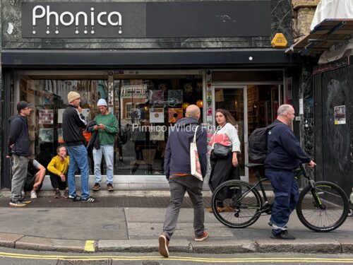
In Outside Phonica, Soho, Johnny Peckham offers us a tableau vivant of urban serendipity — an uncurated congregation at the cultural hinge of sound, style, and suspended time. The photograph’s mise-en-scène, poised on the cusp between motion and idleness, functions as a kind of social palimpsest: Peckham’s lens excavates the poetics of waiting, the choreography of chance, the theatre of the mundane.

Here, Soho becomes not merely a district but a dialect — a visual language where posture, pavement, and public space converse in minor key. Echoes of Eggleston’s chromatic democracy and Cartier-Bresson’s “decisive moment” reverberate through the frame, but Peckham refuses nostalgia. His approach is defiantly contemporary, reveling in the quotidian without sentimentality, allowing what could in other less skilled hands be banal, to shimmer with ontological weight.

Notice the density of gesture: a man in a yellow jumper becomes a punctuation mark against the grey lexicon of London; a cyclist glides like an afterthought through the periphery of narrative; reflections in the glass offer an Escherian recursion — inside becomes outside, observer becomes subject. Peckham’s composition collapses hierarchies, inviting us to read the city as a living collage, where commerce, community, and contingency blur into one continuous act of becoming.

Outside Phonica, Soho is not reportage — it is ritual. It hums with the low frequency of lived experience, a hymn to the fugitive beauty of the everyday. Peckham reminds us that some of the best art is not found; it is overheard.

New work: Bedford Square by My Friend Leslie

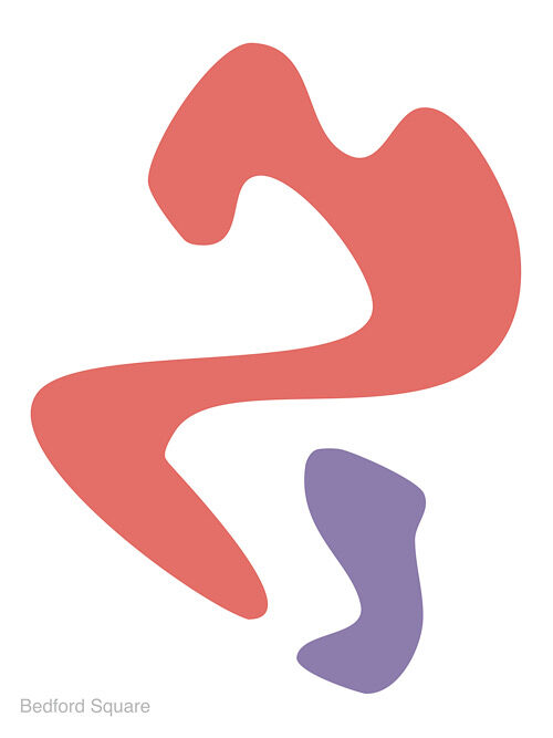
My Friend Leslie’s latest work, Bedford Square operates in that fertile interstice between biomorphism and linguistic deferral, where form insists but never coheres, where signification hovers like a mirage. Two figures—one a sprawling vermilion, the other a more compact lavender—occupy the white ground with an ambivalence that resists both compositional resolution and narrative absorption. What emerges is not an image in the conventional sense, but an ontological problem staged through colour and contour.

The larger red form, with its oscillations between curve and jut, suggests the bodily without ever descending into figuration. It recalls the residual anthropomorphism of Arp’s early reliefs, yet the crisp flatness of its surface pushes it toward the digital, toward a vectorized aesthetic that displaces tactility with pure sign. In contrast, the lavender fragment reads as a supplement or trace, invoking Derrida’s notion of the parergon—that which both belongs to and exceeds the frame, marking the instability of inside and outside, figure and ground.

The faint inscription “Bedford Square” in the corner functions less as a title than as an epistemic intrusion. Here, language sutures itself to abstraction, demanding that we think the work as situated—within geography, within history—while simultaneously refusing to clarify its relation. Is the image a map? A psychogeographic dérive? Or is the textual residue merely a destabilizing gesture, reminding us that no abstraction is ever pure, that every form is haunted by context?

My Friend Leslie’s abstraction, then, is not an escape from the world but a reconfiguration of it—an abstraction that acknowledges its own impurity, its semiotic leakage. It is tempting to read the crimson figure as presence and the lavender as absence, but such binaries collapse in the act of viewing. What persists is tension: between assertion and withdrawal, legibility and opacity, surface and depth.

In the end, My Friend Leslie situates themselves in dialogue not only with the formal histories of modernism (Matisse, Kelly, Arp) but also with the post-structural suspicion of closure. The work is less an image to be looked at than a proposition to be inhabited—a reminder that abstraction’s vitality lies not in what it depicts, but in how it perpetually defers depiction.

Compton – An Exhibition Wall Panel Piece

Compton, Room 2: Landscapes of Disquiet, 2025

UV-cured ink on cotton canvas, 64 x 64

In Room 2: Landscapes of Disquiet, conceptual artist Compton returns to text and reframes the traditional exhibition wall panel as a complete, self-contained artwork. By appropriating and recontextualizing curatorial text originally written for another artist’s show, Compton challenges the conventions of authorship, interpretation, and institutional authority.

The piece reads as an eloquent meditation on landscape and emotion—but in Compton’s hands, it becomes something more: a landscape made of language. The viewer is invited not to imagine the works described, but to consider the descriptive act itself as a performance of meaning-making.

With his signature clarity and subversion, Compton transforms informational text into a poetic object. Clean typography, deliberate spacing, and the cool neutrality of the format only deepen the conceptual tension: what happens when the framing becomes the framed?

Part critique, part homage, and wholly original, Room 2: Landscapes of Disquiet exemplifies Compton’s sharp wit and intellectual rigour. It is a standout piece in his ongoing investigation into the structures that shape our encounters with art.

Price on Request

Sandy Warre-Hole – But Was This the End?, 2025

Digital illustration on archival print

But Was This the End? is a question, an echo, a final frame with no clear origin. In this hauntingly sleek work, Sandy Warre-Hole once again straddles the blurred boundary between narrative and void, assembling a digital portrait that feels more like a film still pulled from a non-existent noir – one where the femme fatale is also the protagonist, the author, and the product.

Rendered in their now-iconic style of flattened colour planes and unapologetically artificial features, Warre-Hole delivers a stark, frontal image of a woman with peroxide-blonde hair, oversized black sunglasses, and crimson lips – the triumvirate of glamour, opacity, and danger. She is instantly iconic and yet somehow anonymous, her identity concealed both literally and metaphorically. This is not a likeness, but a symbol. She could be anyone. She could be everyone.

And then, in the lower left corner, that enigmatic phrase: But was this the end? Typeset in a box that recalls comic book captions or the credits of a telenovela, it injects a cinematic temporality into an otherwise static image. The text implies narrative while simultaneously denying it — a trick Warre-Hole executes with surgical precision. Is this an ending, or merely a beat before the next performance begins?

Visually, the image owes a debt to Pop’s legacy — Warhol, of course, looms large — but Warre-Hole diverges from mere replication by incorporating the affectless sheen of post-social-media visual culture. This is not celebrity idolisation; it is brand embodiment. The woman here is less a person than a constructed shell: sunglasses like screens, lips like emojis, hair like a marketing choice.

Yet, far from being cynical, But Was This the End? is infused with a subtle melancholy. The shadow of a tear (or is it a glitch?) at her cheek suggests vulnerability beneath the polish. The green background — unmodulated and clinical — evokes the blankness of a green screen, hinting that this entire image might be a set waiting to be filled in. We do not see the world around her because there is no world — only projection.

Critically, Warre-Hole inserts her artist’s monogram into the top corner with a flourish that recalls both street art tagging and couture branding. This ambiguous gesture — is it signature, logo, or graffiti? — underscores the tension at the heart of her work: the personal and the performative, the authentic and the constructed.

In the broader context of Warre-Hole’s practice, But Was This the End? may be read as a meditation on digital closure: the desire for endings in an age of endless scrolls, open tabs, and fragmented timelines. It is a lament for narrative coherence — and a sly acknowledgment that we may no longer need it.

Goalie Goes Up: The Art of Leaping Toward the Impossible

Somewhere between the sacred geometry of Kazimir Malevich and the muddy poetry of Sunday league football lies the artist known only as Goalie Goes Up—a name that evokes panic in both the penalty box and the gallery, with its reckless pursuit of glory. This is not merely an alias, but a manifesto. A gesture. An abstraction in motion.

To encounter Goalie Goes Up’s work is to be suspended in a moment of potential energy—“like a goalkeeper,” as one critic has noted, “leaving the safety of the line to chase a corner he will never reach.”* England fans know this sensation well: a bold dash, a nation breathless, and then the crushing inevitability of failure. A loop repeated every four years since 1966, with the unyielding optimism of Lear’s fool: “Thou shouldst not have been old till thou hadst been wise.”

The work itself? Think digital paint not flung but placed, rather like limbs in a last-minute set piece. Shapes avoid collision. Lines buckle. Every canvas is a pitch, every mark a movement, yet not necessarily a goal. There’s a tension between aggression and grace, between the measured formation and the wild lunge. You do not look at a Goalie Goes Up work so much as hear it—boots scraping, lungs bursting, the sound of eighty thousand hopes deflating all at once. It’s as if Caravaggio had spent a rainy childhood watching Tranmere Rovers.

Yet, beneath this appearance of chaos lies thought—philosophy, even. In the artist’s rare interviews (delivered in cryptic riddles on annotated team sheets), she suggests that her abstractions are gestures of belief in the face of impossible odds. “I leap,” she once wrote on the back of a canvas, “not to catch the ball, but to remain human.”

This is art not for the trophy case, but for the long journey home. As Voltaire put it, “One must imagine Sisyphus happy”—or perhaps, one must imagine Sisyphus leaving safety behind and jumping for a late equaliser in extra time.

The cultural critics, understandably confused, have compared Goalie Goes Up to everyone from Cy Twombly to David Seaman. But such comparisons miss the point. This is not an artist who plays with stylistic coherence. Each piece is a stoppage-time decision. A scramble. A tangle of limbs and lines in search of transcendence. Some fail utterly. Some hit the post. But occasionally, gloriously, the art connects—cleanly, sweetly—with a viewer, and the crowd roars.

England’s record in World Cups (one win, eternal heartbreak) finds strange resonance in this practice. The bold lunge of Goalie Goes Up is a national allegory: hopeful, doomed, noble in its futility. It is Beckham’s red card, Southgate’s missed penalty, Pickford’s fingertips. It is art that remembers every near miss and celebrates them as if they were victories.

What a play Shakespeare would have written, had he focused his skills on football. We can only guess what he would have said, but we know that he knew a thing or two about tragic ambition. Maybe he would have described this art with words he gave to Henry V: “Once more unto the breach, dear friends, once more.” The goalie goes up—not because he should, but because he must.

And in that absurd, beautiful leap, leaving his own goal asunder, art lives.

*Kingsley Break, Art Listner, July 2024