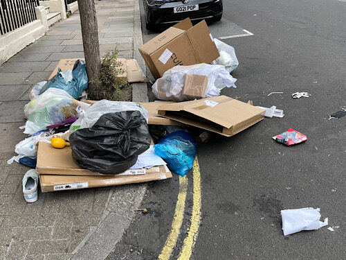
Pore over this image as much as you like, you will not spot a physical bin. Yet this is de facto a bin; it is one of an increasing number of what Oboe refers to as binlessbins, (yes, all one word).
Art catalogue entries
TYPO – Nothing makes sense, 2025
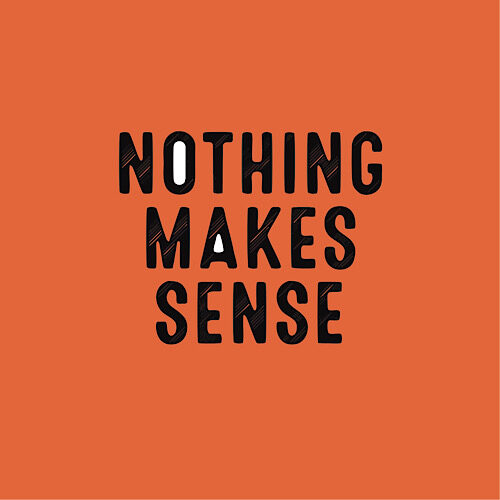
100 x 100 cm
In Nothing makes sense, TYPO delivers yet another incisive rupture in the assumed legibility of language. Here, a single declarative phrase—blunt, exhausted, defiant—is rendered unstable through typographic intervention and chromatic tension. Set against a high-chroma orange ground (a color oscillating between emergency and exuberance), the text is striated, its letterforms visually dislocated, suggesting motion or malfunction—perhaps both.
The phrase “Nothing makes sense” is a recursive loop, a tautology that simultaneously negates itself and affirms its own futility. But TYPO’s manipulation of the letterforms subverts any clean reading. The striations fracture the text, evoking interference patterns, broken signals, or print processes gone slightly awry. It is not glitch as aesthetic, but glitch as epistemology.
Most notable are the white interiors of the O and A—subtle voids of negative space that act as visual apertures, quietly resisting the uniform flatness of the surface. These openings, almost retinal, draw the eye in while the rest of the text repels with abrasiveness. They are holes in the semantic fabric—hollows of clarity in a field of dissonance.
TYPO’s work persistently interrogates the assumption that language can communicate, that it wants to communicate. In this piece, meaning is both insisted upon and withheld, like a promise never meant to be kept. Nothing makes sense becomes not just a statement, but a condition—a phenomenology of comprehension under erasure. It invites the viewer not to decode, but to dwell in the friction between reading and seeing, knowing and not-knowing.
This is not a work about nihilism. It is about the exhausted seduction of coherence.
“Trudi the Tax Consultant” (2025) by Hedge Fund

Digital
Edition of 3 (plus 1 artist’s proof)
Where Mr. Larson explored the weary grandeur of the pub entrepreneur, Trudi expands Hedge Fund’s ever-evolving thesis into the realm of Hyper-luxury — a portrait of aspiration, reinvention, and terminal optimism rendered in more riotous colours than Fund usually uses.
The subject, “Trudi,” is a tax consultant from Cheltenham who, according to footnotes on the Hedge Fund Foundation’s website, once saved an individual so much tax that she received an award from the tax authorities. The prize was given somewhat begrudgingly and the loophole she had been exploiting was immediately closed. Her identity is fluid and unmistakably symbolic — the apotheosis of the self-branding age. In Hedge Fund’s hands, Trudi is both muse and mechanism, person and platform.
Hedge Fund’s compositional strategy here borrows liberally from the color-field minimalists, the techno-ceremonial stylings of Nam June Paik, and the ego-flattening commercial polish of Sephora’s Q4 lighting schemes. Yet under all the colours surely we can discern a deeply human question being asked: What is the value of persona when it’s indistinguishable from product?
Her hair, an electric shade of mauve hardly found in nature or Pantone, defies both physics and good taste with unapologetic aplomb. The effect is disorienting and magnetic.
In the lower left corner, Hedge Fund’s signature appears, and above it a tiny embedded QR code linking to a now-defunct offshore shell company once involved in importing high value wheelie-bins from the UAE — a typical flourish of oblique autobiography from the artist, who continues to merge aesthetics with finance in a way that renders both indistinct.
Critics at the Builth Wells Digital Pavilion called the piece “simultaneously beautiful and ugly.” Trudi herself, when reached via a contact form embedded in her website offered the following statement:
“I didn’t sit for this portrait. Hedge just said he’d seen me once in a Tesco car park and that was enough. It’s a wonderful piece, I just wish I owned it!”
Trudi the Tax Consultant is currently on loan to the West London Institute of Interdisciplinary Futures, displayed in a dimly lit alcove with a placard that reads simply: “Trudi by H.Fund”.
Sandy Warre-Hole – But Was This the End?, 2025

Digital illustration on archival print
But Was This the End? is a question, an echo, a final frame with no clear origin. In this hauntingly sleek work, Sandy Warre-Hole once again straddles the blurred boundary between narrative and void, assembling a digital portrait that feels more like a film still pulled from a non-existent noir – one where the femme fatale is also the protagonist, the author, and the product.
Rendered in their now-iconic style of flattened colour planes and unapologetically artificial features, Warre-Hole delivers a stark, frontal image of a woman with peroxide-blonde hair, oversized black sunglasses, and crimson lips – the triumvirate of glamour, opacity, and danger. She is instantly iconic and yet somehow anonymous, her identity concealed both literally and metaphorically. This is not a likeness, but a symbol. She could be anyone. She could be everyone.
And then, in the lower left corner, that enigmatic phrase: But was this the end? Typeset in a box that recalls comic book captions or the credits of a telenovela, it injects a cinematic temporality into an otherwise static image. The text implies narrative while simultaneously denying it — a trick Warre-Hole executes with surgical precision. Is this an ending, or merely a beat before the next performance begins?
Visually, the image owes a debt to Pop’s legacy — Warhol, of course, looms large — but Warre-Hole diverges from mere replication by incorporating the affectless sheen of post-social-media visual culture. This is not celebrity idolisation; it is brand embodiment. The woman here is less a person than a constructed shell: sunglasses like screens, lips like emojis, hair like a marketing choice.
Yet, far from being cynical, But Was This the End? is infused with a subtle melancholy. The shadow of a tear (or is it a glitch?) at her cheek suggests vulnerability beneath the polish. The green background — unmodulated and clinical — evokes the blankness of a green screen, hinting that this entire image might be a set waiting to be filled in. We do not see the world around her because there is no world — only projection.
Critically, Warre-Hole inserts her artist’s monogram into the top corner with a flourish that recalls both street art tagging and couture branding. This ambiguous gesture — is it signature, logo, or graffiti? — underscores the tension at the heart of her work: the personal and the performative, the authentic and the constructed.
In the broader context of Warre-Hole’s practice, But Was This the End? may be read as a meditation on digital closure: the desire for endings in an age of endless scrolls, open tabs, and fragmented timelines. It is a lament for narrative coherence — and a sly acknowledgment that we may no longer need it.
New work: Chester Hubble

Brompton Road, 2025
In Brompton Road, Chester Hubble continues his quest to interrogate the porous boundary between corporeal fragility and urban indifference. Operating at the volatile intersection of land art, performance, and what he terms “auditory extremity,” Hubble offers not merely a body of work, but a body in work—plunged blindfolded into the arterial chaos of metropolitan life.
Each work emerges not from an intention, but a collision. Daily acts of perambulation—undertaken in a self-imposed state of visual deprivation and accompanied by esoteric heavy metal podcasts—are ritualised into what Hubble refers to as “memories of trauma and transcendence.” Only upon impact—be it with a bollard, a sandwich board, or the bonnet of a Lamborghini Aventador—does Hubble temporarily remove his blindfold, not to see, but to record. The result is a litany of encounters scrawled with forensic immediacy onto linen: “bicycle courier (rather agitated),” “warm dog,” “lightly bloodied scaffold pole (my blood).” These lists, staccato and spare, become textual reliquaries of embodied navigation, each one a whispered prayer to chance and damaged cartilage.
There is, in Hubble’s praxis, an almost monastic devotion to futility. “To be struck down is not failure,” he noted in a recent podcast appearance. “It is interruption. And interruption is a form of punctuation.” This tension—between the will to proceed and the inevitability of being halted—is central to the work’s power. In re-performing failed crossings, Hubble creates a recursive choreography of repetition and risk, confronting mortality not as a thematic gesture, but as a statistical likelihood.
To encounter Brompton Road is to be implicated in a larger topology of absurd devotion. It is not just the map that matters, but the bruises accrued along its path. And if art is, as Hubble suggests, “a way of making the invisible visible,” then this series may be his most visible work yet.