TYPO – Nothing makes sense, 2025

100 x 100 cm

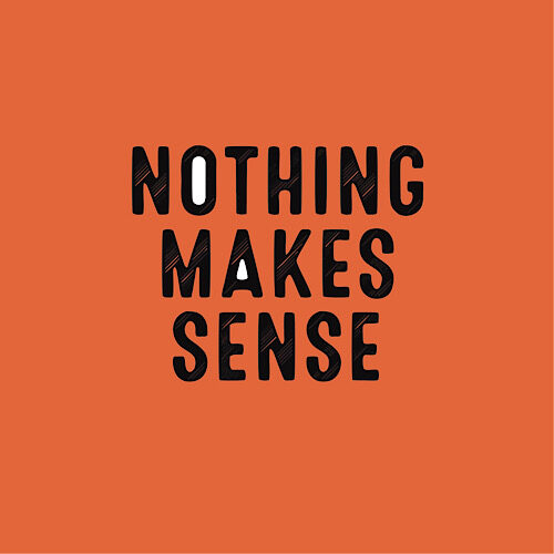
In Nothing makes sense, TYPO delivers yet another incisive rupture in the assumed legibility of language. Here, a single declarative phrase—blunt, exhausted, defiant—is rendered unstable through typographic intervention and chromatic tension. Set against a high-chroma orange ground (a color oscillating between emergency and exuberance), the text is striated, its letterforms visually dislocated, suggesting motion or malfunction—perhaps both.

The phrase “Nothing makes sense” is a recursive loop, a tautology that simultaneously negates itself and affirms its own futility. But TYPO’s manipulation of the letterforms subverts any clean reading. The striations fracture the text, evoking interference patterns, broken signals, or print processes gone slightly awry. It is not glitch as aesthetic, but glitch as epistemology.

Most notable are the white interiors of the O and A—subtle voids of negative space that act as visual apertures, quietly resisting the uniform flatness of the surface. These openings, almost retinal, draw the eye in while the rest of the text repels with abrasiveness. They are holes in the semantic fabric—hollows of clarity in a field of dissonance.

TYPO’s work persistently interrogates the assumption that language can communicate, that it wants to communicate. In this piece, meaning is both insisted upon and withheld, like a promise never meant to be kept. Nothing makes sense becomes not just a statement, but a condition—a phenomenology of comprehension under erasure. It invites the viewer not to decode, but to dwell in the friction between reading and seeing, knowing and not-knowing.

This is not a work about nihilism. It is about the exhausted seduction of coherence.

Language as Material: The Conceptual Architecture of TYPO

The work of TYPO resists easy description, not because it evades meaning, but because it renders meaning unstable and contingent. A text artist in the most rigorous sense, TYPO doesn’t simply use language—they inhabit it, dissect it, expose its ligatures, the joins between rhetoric and ideology, intimacy and performance.

TYPO emerged in the mid-2010s from the internet fog that produced more gloss than grit, with early pieces that mimicked the spatial dislocation of browser tabs: vinyl text installations that wrapped entire rooms in iterative phrases, none of which resolved. The viewer was not asked to read so much as to navigate the space without tiring. In I Am Not Speaking (2016), black Helvetica peeled from the white walls in syncopated phrases—“I am not speaking / but you are hearing / but not me”—creating a textual stammer that implicated the audience in an act of unwilling translation.

Over the last decade, TYPO has refined this practice into something less declarative, more forensic. Their recent exhibition, Parentheticals, at the Textual Archive in Los Angeles, offered a taxonomy of asides: the gallery walls were bare save for parentheses—sculptural, textual, digital—that bracketed nothing or everything, depending on one’s interpretive tilt. The effect was not emptiness, but a kind of semantic hyperventilation.

Like other artists working in the long shadow of conceptualism—Jenny Holzer, Glenn Ligon, Kay Rosen—TYPO shares a belief in language as a site of both constraint and possibility. But where Holzer’s text is aphoristic, Rosen’s architectural, Ligon’s embodied, TYPO’s is most often incomplete. Their practice is dialogic in a literal sense: many of their pieces derive from actual conversations—transcripts, SMS exchanges, voice-to-text artifacts—abstracted until the voice dissolves and only cadence remains.

This is most evident in the 2023 piece Mutualisms, a durational performance-installation in which two typists sit across from each other, transcribing overheard conversations from a hidden mic feed elsewhere in the gallery. The typed texts are projected live, side by side, revealing the subjective distortions of each listener. Here, TYPO returns to the primal instability of language—not only as it is spoken and heard, but as it is interpreted, claimed, and misread.

Critics have sometimes dismissed TYPO’s work as overly academic, citing the density of references (Lacan, Derrida, Glissant), the footnoted titles, the avoidance of materiality beyond text. But this critique misunderstands the object of their inquiry. TYPO doesn’t use language to say something; they use it to interrogate the act of saying itself. The result is work that doesn’t seduce the eye so much as seduce the act of attention, demanding a slow, recursive engagement that refuses the passive consumption of text as image.

And yet there is beauty here. Not just in ornament, but in structure—in the deliberate architecture of confusion, in the tensions between absence and presence, between reading and not-reading. In this way, TYPO reminds us that language can sometimes be sculptural. And that meaning is something we move around, inhabit, and have to work to achieve ourselves.

Compton – An Exhibition Wall Panel Piece

Compton, Room 2: Landscapes of Disquiet, 2025

UV-cured ink on cotton canvas, 64 x 64

In Room 2: Landscapes of Disquiet, conceptual artist Compton returns to text and reframes the traditional exhibition wall panel as a complete, self-contained artwork. By appropriating and recontextualizing curatorial text originally written for another artist’s show, Compton challenges the conventions of authorship, interpretation, and institutional authority.

The piece reads as an eloquent meditation on landscape and emotion—but in Compton’s hands, it becomes something more: a landscape made of language. The viewer is invited not to imagine the works described, but to consider the descriptive act itself as a performance of meaning-making.

With his signature clarity and subversion, Compton transforms informational text into a poetic object. Clean typography, deliberate spacing, and the cool neutrality of the format only deepen the conceptual tension: what happens when the framing becomes the framed?

Part critique, part homage, and wholly original, Room 2: Landscapes of Disquiet exemplifies Compton’s sharp wit and intellectual rigour. It is a standout piece in his ongoing investigation into the structures that shape our encounters with art.

Price on Request

Room 3: Exhibition Wall Panel

Compton, Room 3: A Turning Point (1980–1995), 2025

Printed text on canvas

Room 3: A Turning Point reimagines the traditional exhibition wall panel as a work of art, transforming informational text into a poetic and conceptual meditation. Printed on canvas, this piece blurs the boundaries between documentation and creation, challenging viewers to reflect on how narrative shapes our understanding of art, time, and legacy.

Compton’s mastery lies in their ability to elevate the ordinary. By isolating and reframing text, they invite the audience to focus on its rhythm, structure, and emotional weight. The work’s minimalist design, with precise typography and balanced composition, mirrors the quiet intensity of its content, drawing attention to every carefully chosen word.

This piece is an ode to Compton’s enduring fascination with language as both medium and message, offering a profound commentary on art’s capacity to interpret itself. A singular and thought-provoking addition to any collection, Room 3: A Turning Point embodies their reputation as a boundary-pushing innovator in contemporary art.

Price on Request.